

Beer Punch
Brand identity for a modern, high-energy book club
A bold, high-energy brand identity for Beer Punch Book Club, a modern book club with ambitions to expand into a larger online presence through a future website, YouTube channel, and eventually a craft beer brand. The goal was to create a visual identity that feels loud, youthful, and instantly recognizable while remaining flexible enough to grow alongside the brand.
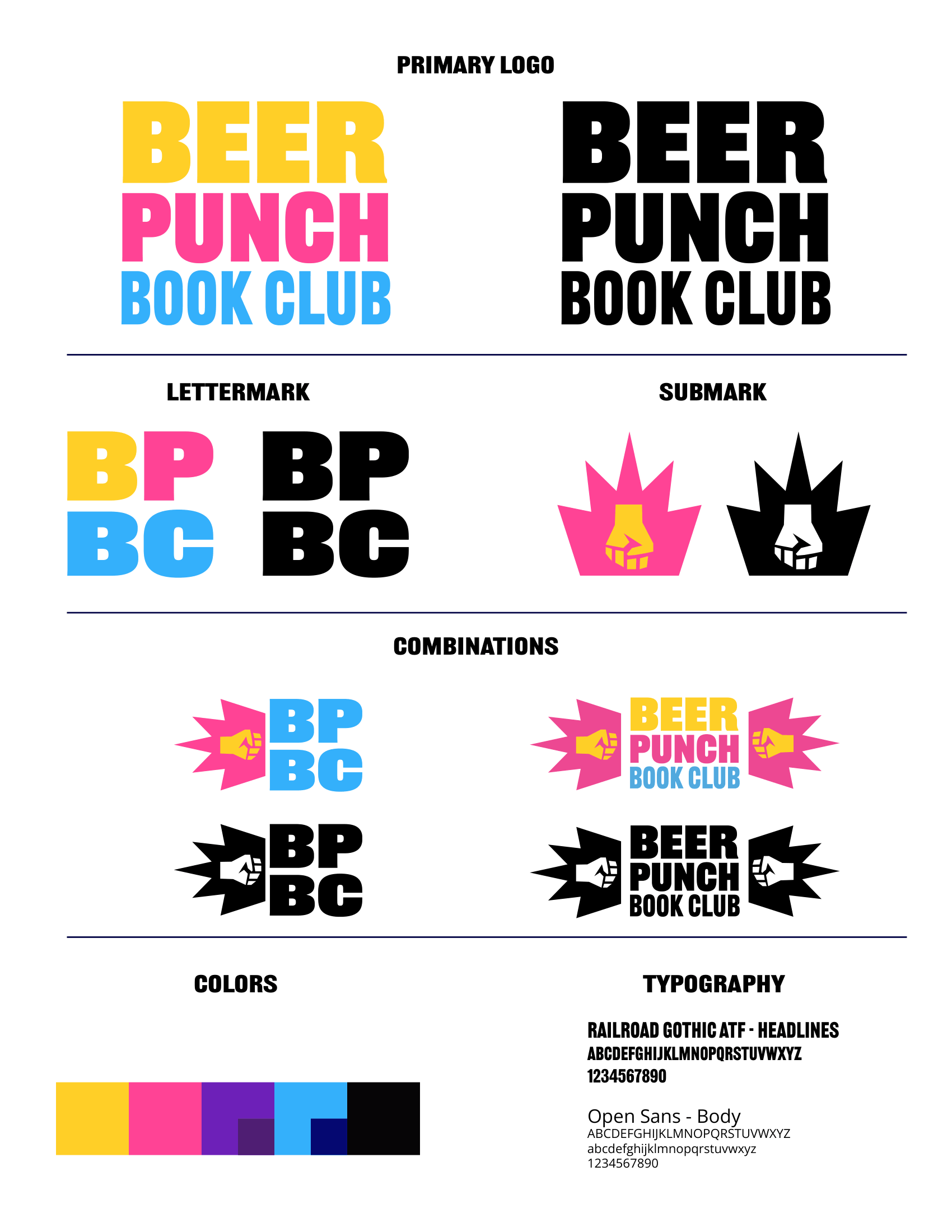
The branding system includes a complete logo suite featuring a primary wordmark, secondary lettermark, submark/symbol, and multiple combination examples integrating both the primary and secondary marks with the brand symbol. Each logo was delivered in full color and in black-and-white variations to ensure versatility across digital, print, and merchandise applications.
The visual direction centers around an unapologetically vibrant color palette and the thick, sans-serif Railroad Gothic ATF for headlines and logo treatments, giving the identity an in-your-face presence, while Open Sans provides clean readability for body copy. A key element of the identity is the custom geometric brand symbol: a yellow fist layered over a bright magenta spiked motion shape that evokes energy, impact, and momentum. Combined with the typography, the system creates a punchy, attention-grabbing aesthetic designed to resonate with a younger audience ranging from their early 20s to late 30s.


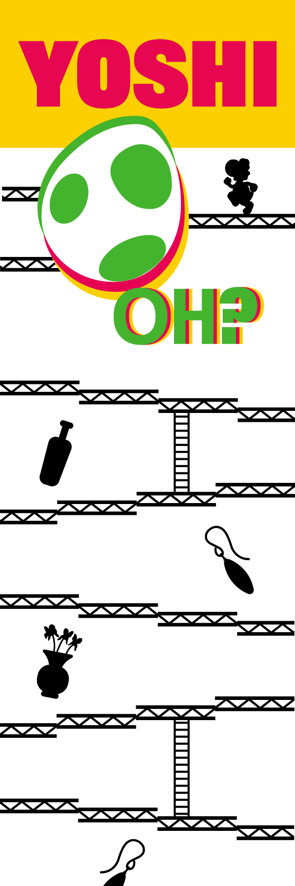

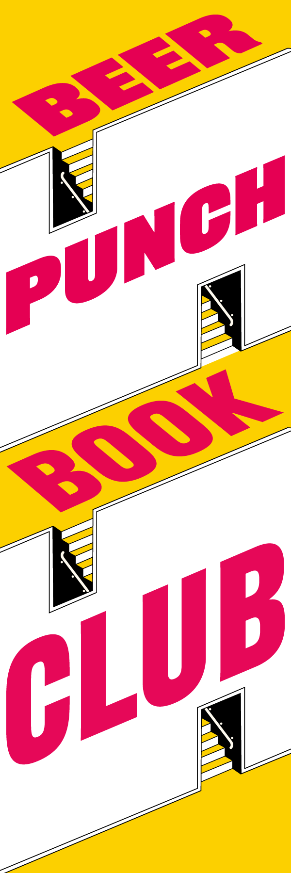

As part of Beer Punch Book Club’s BYOB-style meetings, members participate in creative activities inspired by each month’s featured book. One of the club’s ongoing traditions is designing custom bookmarks themed around the current read, with members voting on their favorite concepts before the selected designs are recreated digitally and professionally printed.
For The Man Who Died Seven Times, I transformed three member-created bookmark concepts into polished digital designs, refining layouts and adapting each piece to a standardized 2” x 6” format for print production. In addition to preserving the personality and originality of the handmade concepts, I ensured each design maintained visual consistency and readability in its final form.
To expand the collection, I also designed two original bookmarks inspired by the book while incorporating the bold visual identity of Beer Punch Book Club. These designs blend the club’s branding with the stylistic elements connected to the story.
Back