

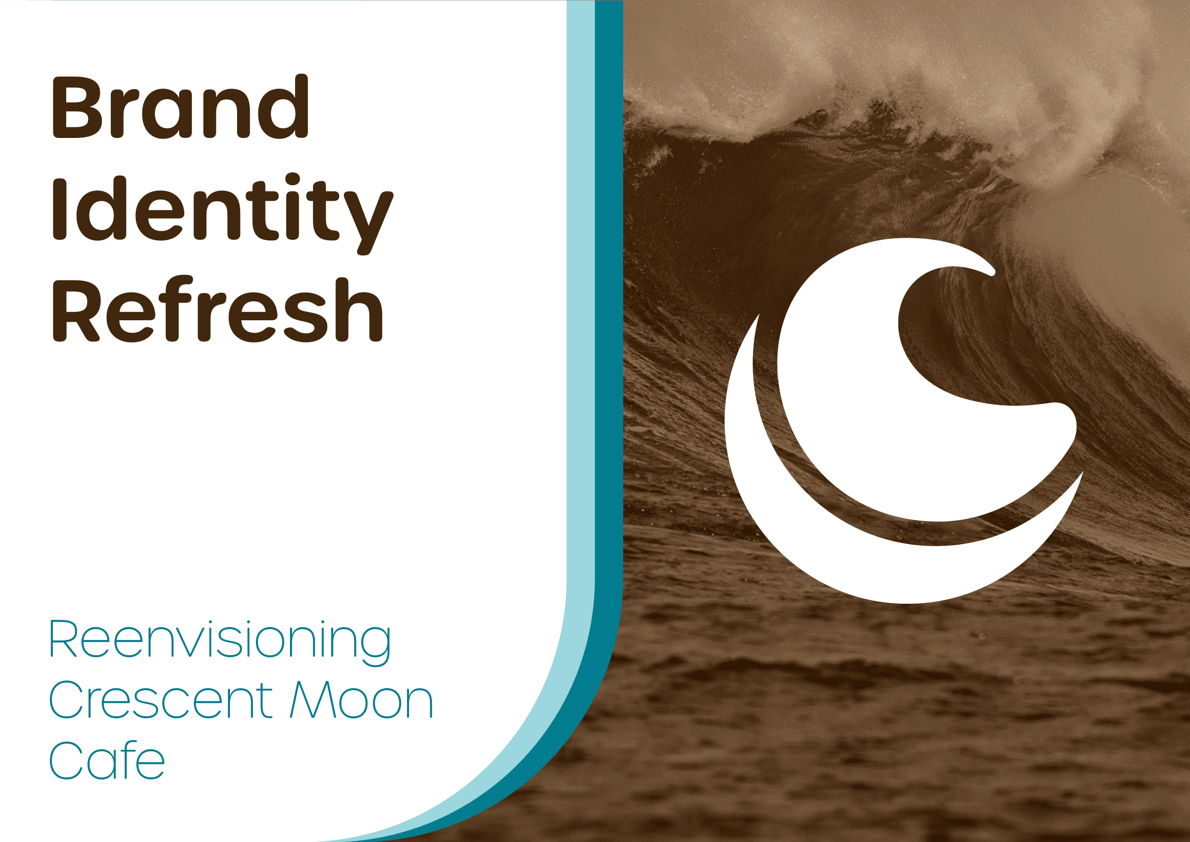
Crescent Coffee
Brand identity and rebrand for a modern coastal coffee company
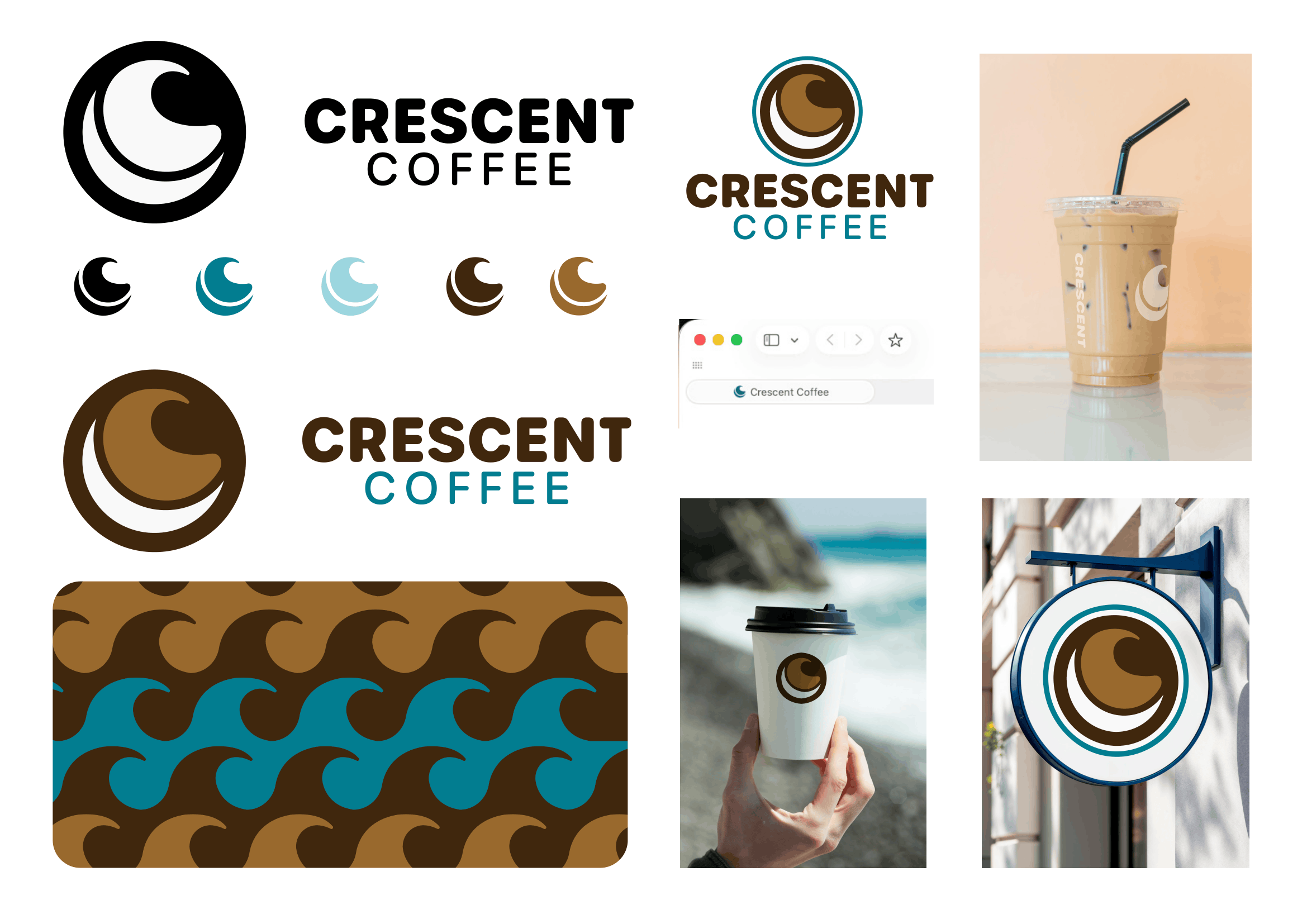
This project is a conceptual rebrand of the identity for a seaside coffee shop, originally created early in my college career. Revisiting the project allowed me to refine both the visual system and the strategic thinking behind the brand, transforming it from a small café concept into a scalable modern coffee company.
The redesign focused on creating a cleaner, more versatile identity while preserving the warmth and coastal character of the original brand. Updates included a refined geometric logo, a simplified and more legible wordmark, and an expanded color palette that introduces deeper contrast and a stronger visual presence. The rebrand also involved repositioning the business through a shortened name and a more adaptable identity system designed to work across packaging, merchandise, signage, and future expansion.
This project reflects my growth as a designer by combining branding strategy with stronger typography, visual consistency, and real-world usability considerations.
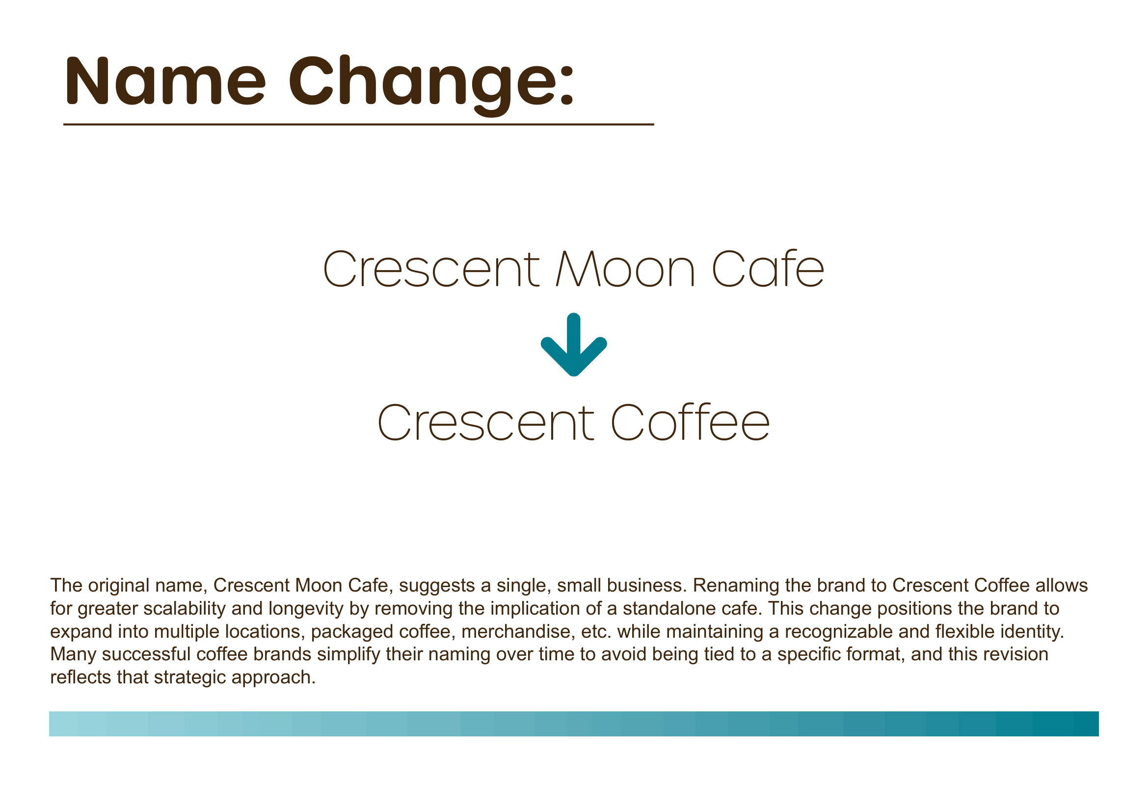
The original name, Crescent Moon Cafe, suggests a single, small business. Renaming the brand to Crescent Coffee allows for greater scalability and longevity by removing the implication of a standalone cafe. This change positions the brand to expand into multiple locations, packaged coffee, merchandise, etc., while maintaining a recognizable and flexible identity.
Many successful coffee brands simplify their naming over time to avoid being tied to a specific format, and this revision reflects that strategic approach.
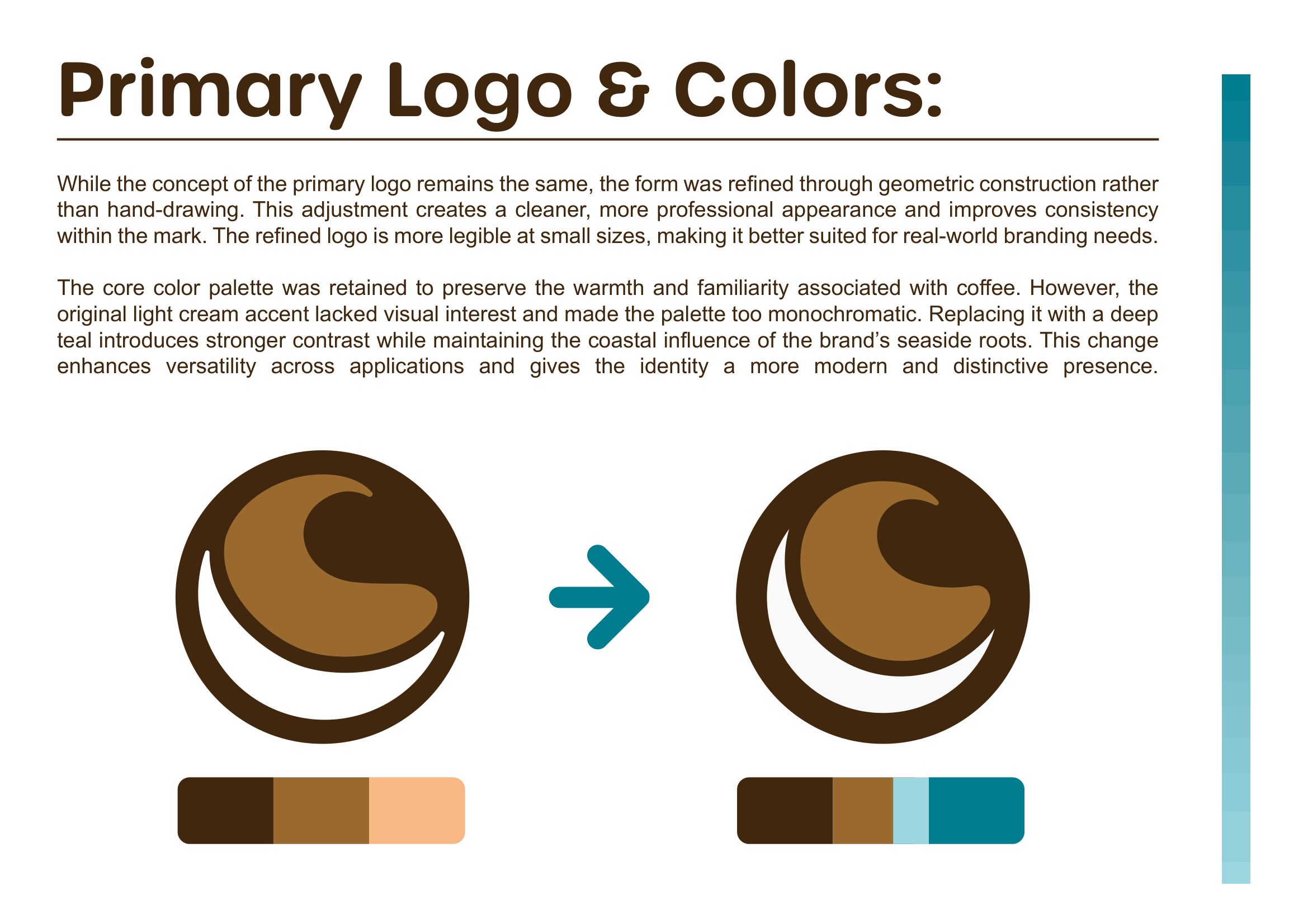
While the concept of the primary logo remains the same, the form was refined through geometric construction rather than hand-drawing. This adjustment creates a cleaner, more professional appearance and improves consistency within the mark. The refined logo is more legible at small sizes, making it better suited for real-world branding needs.
The core color palette was retained to preserve the warmth and familiarity associated with coffee. However, the original light cream accent lacked visual interest and made the palette too monochromatic. Replacing it with a deep teal introduces stronger contrast while maintaining the coastal influence of the brand's seaside roots. This change enhances versatility across applications and gives the identity a more modern and distinctive presence.
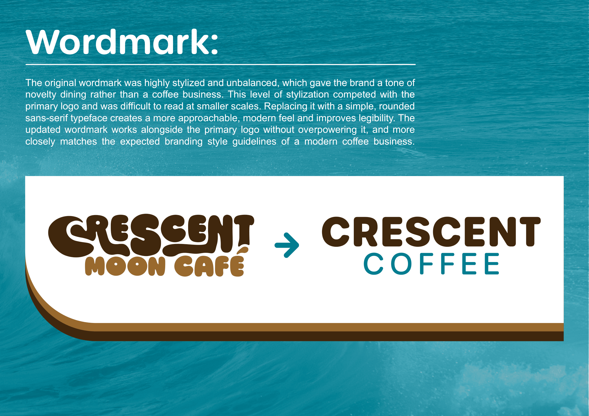
The original wordmark was highly stylized and unbalanced, which gave the brand a tone of novelty dining rather than a coffee business. This level of stylization competed with the primary logo and was difficult to read at smaller scales. Replacing it with a simple, rounded sans-serif typeface creates a more approachable, modern feel and improves legibility. The updated wordmark works alongside the primary logo without overpowering it, and more closely matches the expected branding style guidelines of a modern coffee business.
View the original brand identity board: