
Tips to Talons
Branding for a small nail business inspired by DnD and fantasy.
Tips to Talons is a custom press-on nail business centered around creativity, fandom culture, and self-expression. This project involved developing a complete visual identity system that captured the brand’s playful personality while remaining polished and versatile.
The branding draws inspiration from fantasy and gaming aesthetics, blending both sharp and curvy stylized elements with fun and approachable typography and decorative iconography. The primary logo incorporates custom details inspired by swords and claw shapes to reflect both the brand's fantasy influence and the bold nature of the nail art. Supporting secondary marks were designed to provide flexibility for social media, packaging, stamps, and smaller branded applications while maintaining a cohesive visual language.
Alongside the logo system, the project included typography selection, brand tone development, and visual direction to create a welcoming and imaginative customer experience.
At Tips to Talons, our mission is to create high-quality, customizable press-on nails that celebrate creativity, fandom, and self-expression. The brand is built around flexibility and collaboration, working with customers to design nails that reflect their interests, personalities, and favorite fictional worlds. Every set aims to balance durability with imaginative design so customers can enjoy nails that look great and last.
Friendly
The brand feels welcoming and excited to connect with people who share a love
Playful
The tone embraces humor, lightheartedness, and a sense of fun inspired by fandom culture. Messaging can include clever references, puns, or subtle nods to games and fantasy worlds while keeping the brand approachable and entertaining.
Imaginative
The voice celebrates creativity and storytelling, encouraging customers to think of their nails as tiny pieces of art that reflect characters, themes, and the imaginative worlds they love.
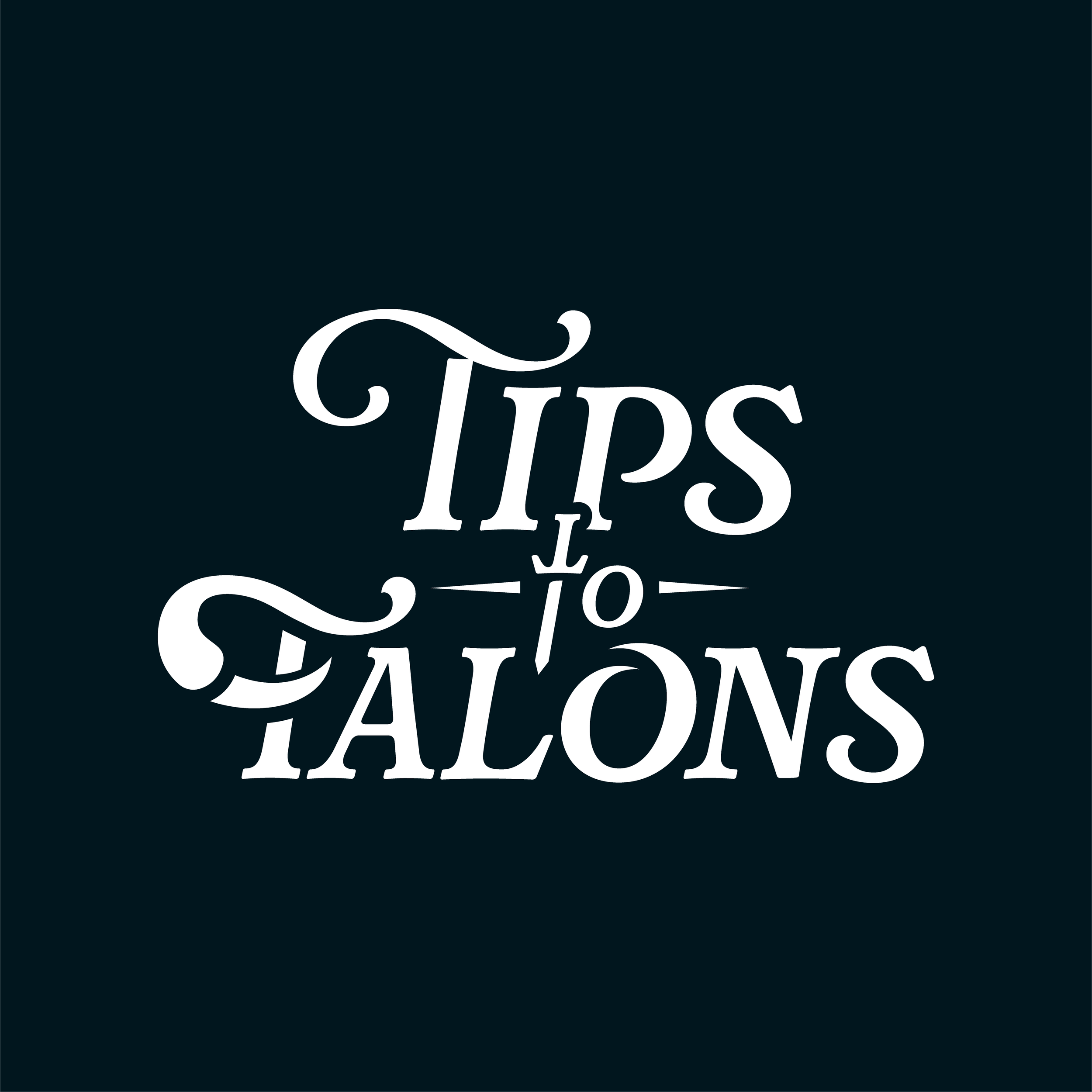
The primary Tips to Talons logo is a vertical wordmark. The “t” in “to” is stylized as a sword, referencing fantasy and gaming themes, while the “T” in “Talons” features a claw-like detail that ties into the concept of sharp, powerful nails. This logo serves as the main brand identifier and is intended for use on packaging and digital headers.
Two secondary logos were created to provide simplified versions of the brand mark for smaller applications. The first is the stylized “T” from “Talons” from the primary logo. This mark works well as a compact brand identifier for social media, small icons, and embroidery, where the full wordmark may be too detailed. The second secondary mark takes the claw/swoosh element from the “T” and repeats it radially to form a shape that subtly resembles a flower and nails. This creates a decorative symbol that can be used as an icon, pattern element, social media graphic, or small brand stamp, adding visual interest while still referencing the core brand identity.